Table of Contents
Overview
This report provides summarized information for different metrics, allowing users to analyze the campaign overall results. Users can customize the charts layout, select which charts to show, how to group the results, and the date range to analyze.
Layout
The Layout drop down menu lets users configure if they want 1 or 2 charts per row. Once this is configured, each chart can be expanded or collapsed independently.
Charts
Each chart shows information about a specific metric. The Charts drop down menu lets users show or hide specific charts, or change the order in which they’re shown. This configuration is stored in the browser, so the next time a user accesses the report, charts are shown honoring the configured layout.
Most cards combine 2 charts:
- A bar chart on the left
- A pie chart on the right
The bar chart shows the evolution of the metric over time. On the other hand, the pie chart shows the final distribution of the metric when the time frame ends.
The following charts are available:
Campaign Progress
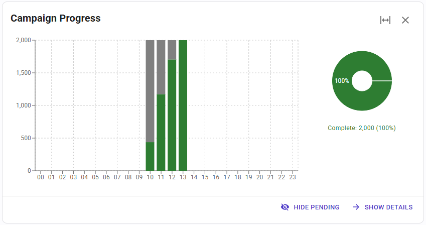 This chart splits the numbers to call in 2 categories:
- Complete: how many numbers have been already contacted, i.e. with a successful call, or having consumed all the attempts for that number. These numbers will not be called again.
- Pending: how many numbers have not been called or have at least a call attempt still pending. These numbers will be called again.
In the bar chart users can see the evolution of these contact attempts. In the pie chart, users can see the final distribution of the campaign progress when the report time frame ends.
The “Show Details” button switches the view to a table, where all these metrics are displayed, and users can export the data to a CSV file.
Contact Progress
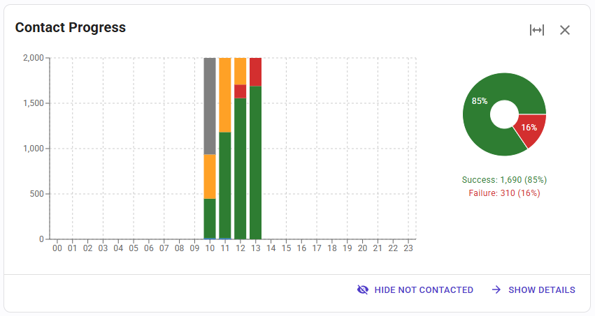 This card splits the previous metric in 6 different values, providing more details on what’s happening with each number to call:
- Not Contacted: numbers that have not been contacted yet.
- Contacting: numbers being called when the report was triggered.
- In Black List: numbers that were in a black list when SIP Caller tried to call them.
- Success: numbers with a successful call result, i.e. because a human answered the call, or an answering machine did and the campaign is configured to not retry these calls.
- Failure: numbers that could not be successfully contacted once all the attempts have been consumed.
- Retry Pending: numbers that could not be successfully contacted yet, but still have pending attempts to try.
In the bar chart users can see the evolution of these contact attempts. In the pie chart, users can see the final distribution of the contact progress when the report time frame ends.
The “Show Details” button switches the view to a table, where all these metrics are displayed, and users can export the data to a CSV file.
Call Flow Diagram

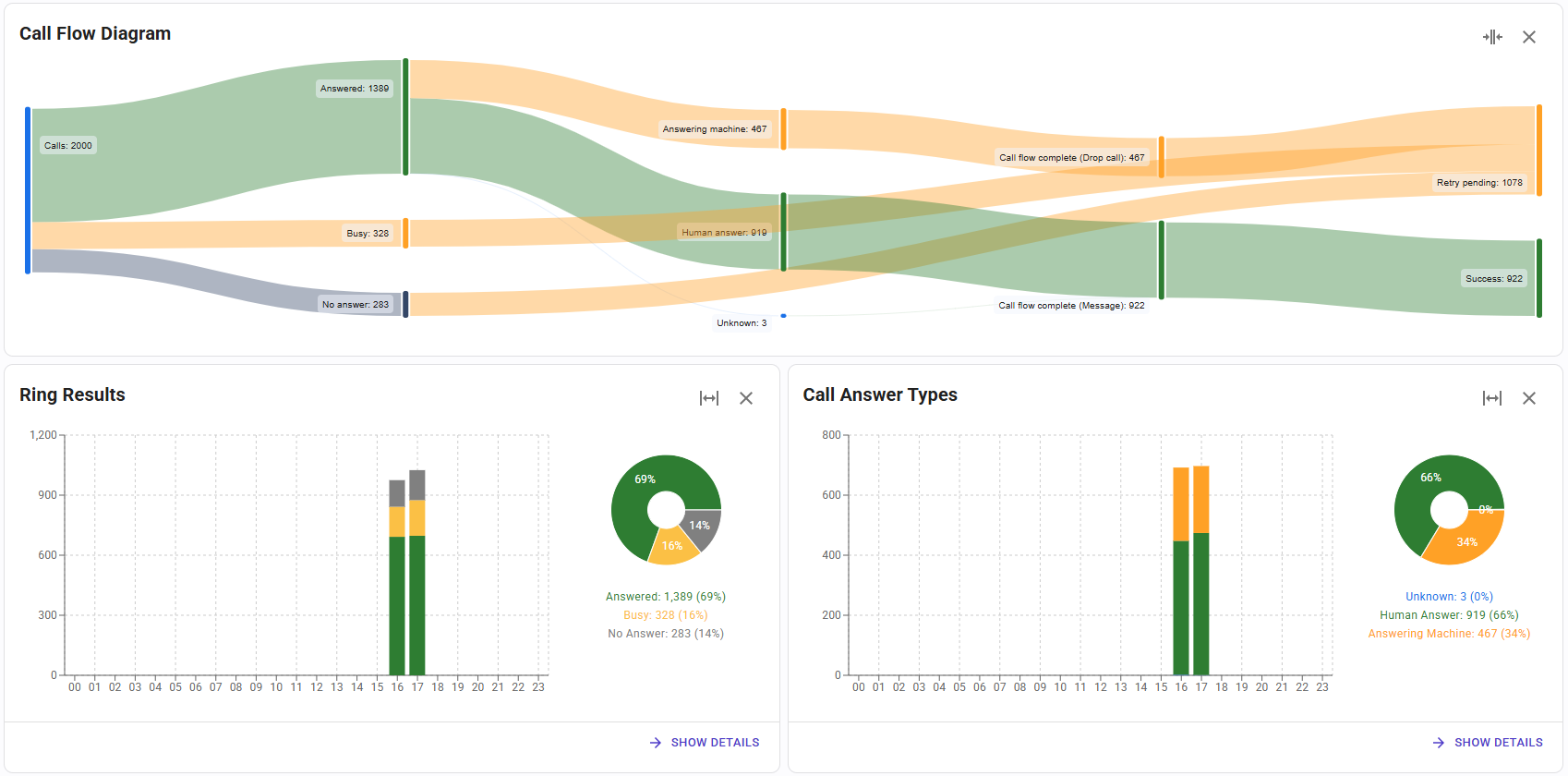
This chart shows the information using a Sankey diagram, and considers the status at the end of the report time frame. The diagram starts on the left with the total number of calls, and then the flow is distributed according to the call result (Answered, Busy, No Answer, Call Error). Next, answered calls are splitted according to the answering endpoint (Human Answer or Answering Machine). The flow continues splitting these according to the call end type (Hang Up, Call Flow Complete, or Execution Error). Finally, the flow is splitted again considering the call outcome (Success, Failure, or Retry Pending).
This uncommon and useful diagram helps users understand what’s happening with the calls being made. The details of each metric used in this diagram are exposed in the following charts.
Ring Results
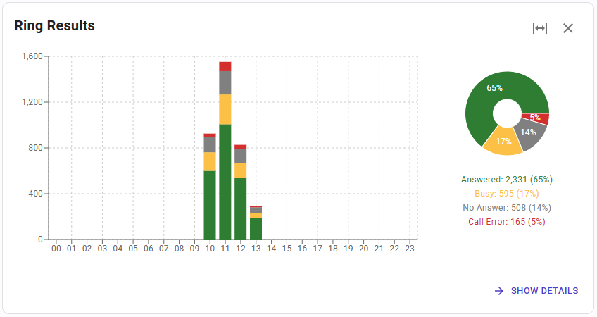 This card shows the result for all the call attempts during the selected time frame. For progressive dialer campaigns, this card will show the details of the call from SIP Caller to the agent. Each call will have one of the following ring results:
- Answered: the call is answered, no matter the answering endpoint (human answer or answering machine).
- Busy: the destination is busy.
- No Answer: the call has not been answered after the configured ring timeout.
- Call Error: the server returns an error when the call is requested.
In the bar chart users can see the number of calls having each call result, for each time slot. In the pie chart, users can see the total number of calls having each call result during the entire report time frame.
The “Show Details” button switches the view to a table, where all these metrics are displayed, and users can export the data to a CSV file.
Number Ring Results
This card is only shown for progressive dialer campaigns, and shows the result for all the call attempts to the external numbers during the selected time frame. Each call will have one of the following ring results:
- Connected: the call between the agent and the external number is established.
- Not Connected: the call between the agent and the external number is not established, because the destination didn't answer, was busy, or by any other reason.
- Not Called: the call to the external number has not been initiated. This could happen if the agent doesn't confirm the call to SIP Caller when a DTMF key is required to proceed, or the agent hangs up before SIP Caller tries to make the call to the external number.
In the bar chart users can see the number of calls having each call result, for each time slot. In the pie chart, users can see the total number of calls having each call result during the entire report time frame.
The “Show Details” button switches the view to a table, where all these metrics are displayed, and users can export the data to a CSV file.
Queues
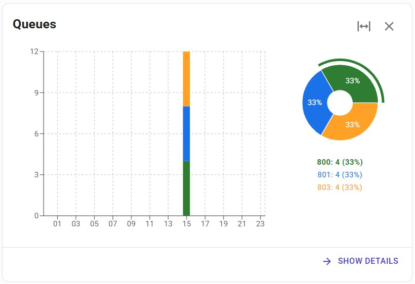
This card is only shown for progressive dialer campaigns targeting multiple queues, and shows the distribution of calls to each queue during the selected time frame.
In the bar chart users can see the number of calls targeting each queue, for each time slot. In the pie chart, users can see the total number of calls targeting each queue during the entire report time frame.
The “Show Details” button switches the view to a table, where all these metrics are displayed, and users can export the data to a CSV file.
Call Answer Types

This card shows the classification of the answering endpoint during the selected time frame. This will only be shown when the answering machine detection is enabled. Each call will have one of the following answer types:
- Human Answer: when SIP Caller detects that the call has been answered by a human.
- Answering Machine: when SIP Caller detects that the call has been answered by an answering machine.
- Unknown: when the call is dropped by the callee before SIP Caller determines the type of answering endpoint, or when the answering machine detection is disabled for the campaign.
In the bar chart users can see the number of calls having each type of answer, for each time slot. In the pie chart, users can see the total number of calls having each type of answer during the entire report time frame.
The “Show Details” button switches the view to a table, where all these metrics are displayed, and users can export the data to a CSV file.
Call End Types
This card shows the reason why each call ends, during the selected time frame. Each call will have one of the following end types:
- Hang Up: the callee drops the call before the call flow reaches the end.
- Call Flow Complete: SIP Caller drops the call when the call flow reaches the end.
- Execution Error: SIP Caller drops the call before the call flow reaches the end, due to an error.
In the bar chart users can see the number of calls having each end type, for each time slot. In the pie chart, users can see the total number of calls having each end type during the entire report time frame.
The “Show Details” button switches the view to a table, where all these metrics are displayed, and users can export the data to a CSV file.
Call Outcomes
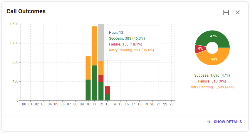
This card shows the call outcome during the selected time frame. Each call will have one of the following outcomes:
- Success: the call has been considered successful, because it’s been answered by a human, or also answered by an answering machine and the campaign is configured to not retry these calls.
- Failure: the call has not been answered, or has been answered by an answering machine and the campaign is configured to retry these calls. Also, there are no remaining attempts for this number.
- Retry Pending: the call has not been answered, or has been answered by an answering machine and the campaign is configured to retry these calls. Also, there are still remaining attempts for this number.
In the bar chart users can see the number of calls having each outcome, for each time slot. In the pie chart, users can see the total number of calls having each outcome during the entire report time frame.
The “Show Details” button switches the view to a table, where all these metrics are displayed, and users can export the data to a CSV file.
SIP Status Codes
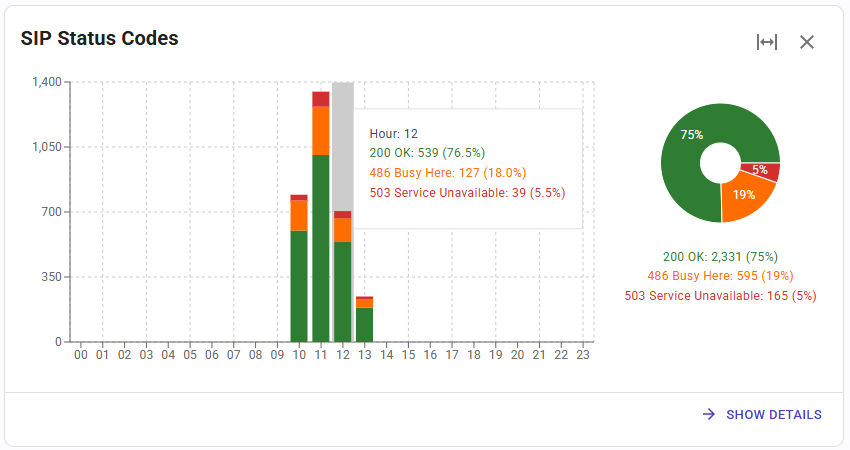
This card shows the SIP Status Code for each call during the selected time frame. These codes are listed here.
In the bar chart users can see the number of calls having each SIP Status Code, for each time slot. In the pie chart, users can see the total number of calls having each SIP Status Code during the entire report time frame.
The “Show Details” button switches the view to a table, where all these metrics are displayed, and users can export the data to a CSV file.
Group By
The data shown by this report can be grouped into different time units:
- Hour
- Day
- Week
- Month
- Year
All the reports support “drill down”. This is, when the report shows data grouped by a larger time unit (for example, a month), clicking on an item (for example, a day) displays the report for that reduced time frame. Using this technique, it’s very easy to view how the metric is distributed along a reduced time frame, and navigate up and down with ease.
Date Range Selection
By default, when the report is executed the first time, the date range is set to the entire campaign working dates. This can be changed from the drop down menu on the upper right corner.
