Table of Contents

Overview
This report is only available when the campaign uses a call flow that requires DTMF input from the callee, and provides summarized information about these inputs, allowing users to analyze the campaign overall results. Users can customize the charts layout, select which charts to show, how to group the results, and the date range to analyze.
Layout
The Layout drop down menu lets users configure if they want 1 or 2 charts per row. Once this is configured, each chart can be expanded or collapsed independently.
Charts
Each chart shows information about a specific input. The Charts drop down menu lets users show or hide specific charts, or change the order in which they’re shown. This configuration is stored in the browser, so the next time a user accesses the report, charts are shown honoring the configured layout.
User input cards combine 2 charts:
- A bar chart on the left
- A pie chart on the right
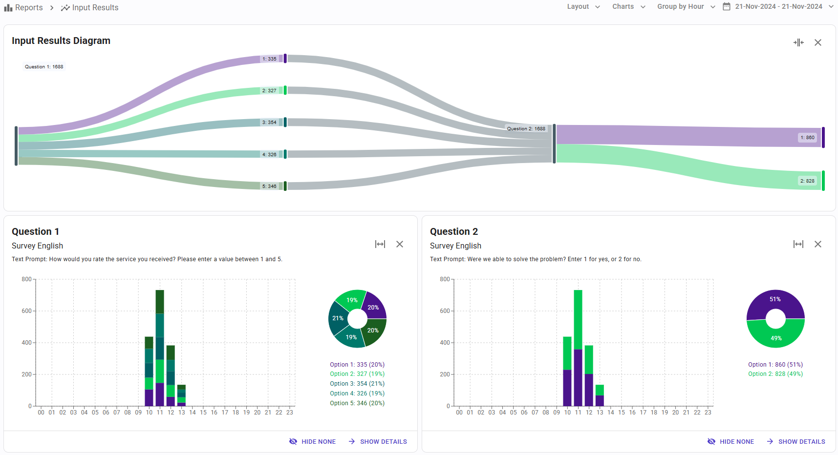
The bar chart shows the evolution of the input over time. On the other hand, the pie chart shows the final distribution of the input when the time frame ends.
The following charts are available:
Input Results Diagram
 This chart shows the information using a Sankey diagram, and considers the status at the end of the report time frame. The diagram starts on the left with the total number of calls that were exposed to the first input or question, and then the flow is distributed according to the answers provided. The flow continues for each input in the call flow, and how users respond to them.
This uncommon and useful diagram helps users understand what’s happening with the calls being made.
A card for each input

This card shows the distribution of answers for each input, during the selected time frame.
In the bar chart users can see how many users have answered with each value, for each time slot. In the pie chart, users can see the total number of answers having each value during the entire report time frame.
The “Show Details” button switches the view to a table, where all these metrics are displayed, and users can export the data to a CSV file.
Group By
The data shown by this report can be grouped into different time units:
- Hour
- Day
- Week
- Month
- Year
All the reports support “drill down”. This is, when the report shows data grouped by a larger time unit (for example, a month), clicking on an item (for example, a day) displays the report for that reduced time frame. Using this technique, it’s very easy to view how the metric is distributed along a reduced time frame, and navigate up and down with ease.
Date Range Selection
By default, when the report is executed the first time, the date range is set to the entire campaign working dates. This can be changed from the drop down menu on the upper right corner.
